

575 字
3 分钟
Layout
一、 方向部件
- Row
- 水平方向
- 主轴方向:向右
- Column
- 垂直方向
- 主轴方向:向下
- Stack
- 屏幕内外方向
- 主轴方向:向屏幕外
1.1 主轴方向调整
Row 和 Column 可以通过调整主轴方向达到不同布局效果。
1. 默认主轴方向
class MyRowColumn extends StatelessWidget { @override Widget build(BuildContext context) { return Container( color: Colors.white, alignment: Alignment(1, 0),// x 对 Row 没影响 y 对 Column 无效 child: Column( children: [ Container( child: Icon(Icons.add_a_photo), color: Colors.red, alignment: Alignment(0,0), ), Container( child: Icon(Icons.add_alarm), color: Colors.yellow, alignment: Alignment(-1,0), ), Container( child: Icon(Icons.add_alert), color: Colors.green, alignment: Alignment(1,0), ), ], ), ); }}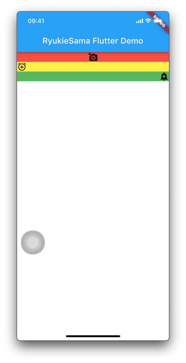
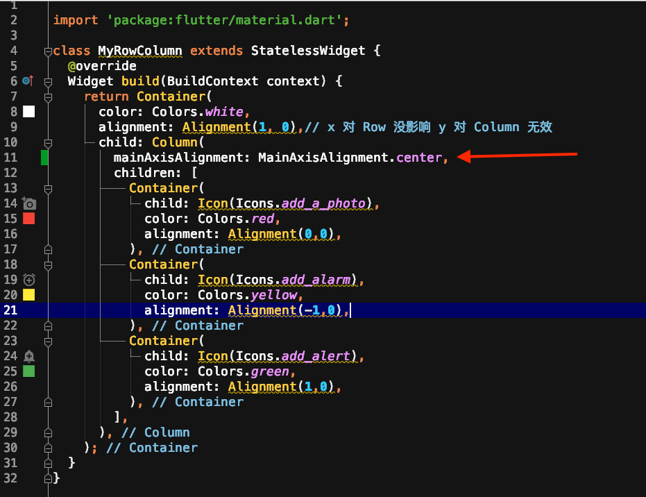
2. MainAxisAlignment.center
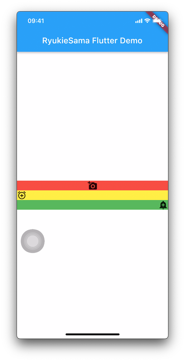
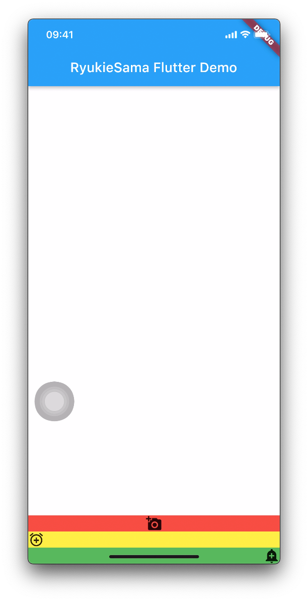
3. MainAxisAlignment.end
4. MainAxisAlignment.spaceAround
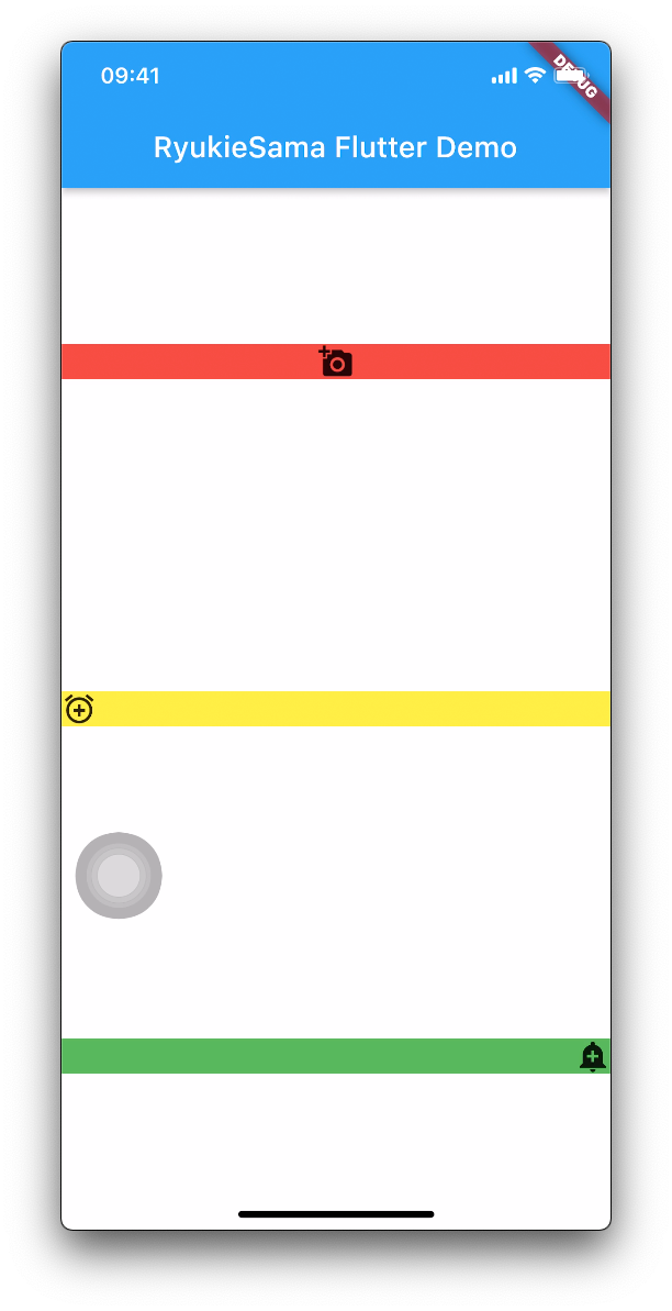
5. MainAxisAlignment.start
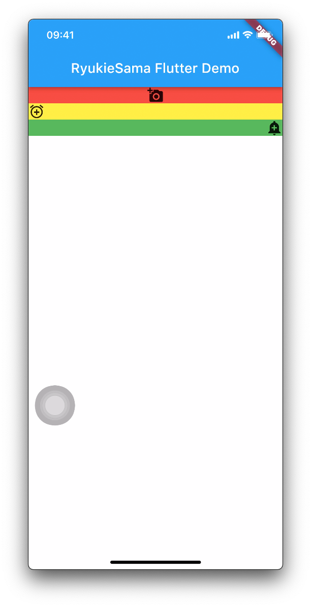
6. MainAxisAlignment.spaceBetween
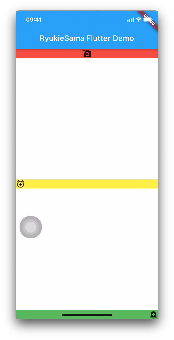
7. MainAxisAlignment.spaceEvenly
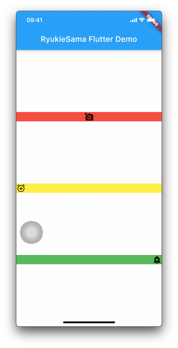
1.3 交叉轴
交叉轴 是垂直与主轴方向的
class MyRowColumn extends StatelessWidget { @override Widget build(BuildContext context) { return Container( color: Colors.brown, child: Column( mainAxisAlignment: MainAxisAlignment.spaceEvenly, crossAxisAlignment: CrossAxisAlignment.start, children: [ Container( child: Icon( Icons.add_a_photo, size: 100, ), color: Colors.red, ), Container( child: Icon( Icons.add_alarm, size: 50, ), color: Colors.yellow, ), Container( child: Icon( Icons.add_alert, size: 30, ), color: Colors.green, ), ], ), ); }}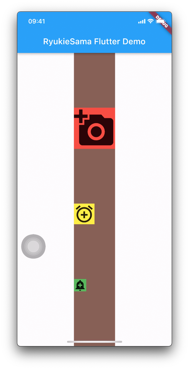
1.4 Stack

如下布局我们可以得到如图效果
class MyStack extends StatelessWidget { const MyStack({Key? key}) : super(key: key);
@override Widget build(BuildContext context) { return Container( child: Stack( children: [ Container( color: Colors.red, child: const Icon( Icons.add_alarm, size: 200, color: Colors.green, ), ), Container( color: Colors.green, child: const Icon( Icons.add_a_photo, size: 100, color: Colors.yellow, ), ), Container( color: Colors.black, child: const Icon( Icons.add_a_photo_rounded, size: 60, color: Colors.blue, ), ), ], ), ); }}1. 子Widget布局调整
我们可以发现,默认都是从左上角开始布局的。如果想要调整子Widget的位置我们该怎么做呢?
2. Positioned
A [Positioned] widget must be a descendant of a [Stack].
只可用于
Stack
通过 Positioned 我们可以调整 子Widget 相对 父Widget 的位置
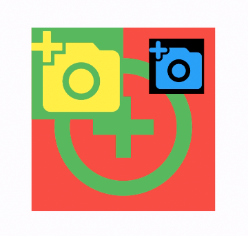
Positioned( right: 12, top: 12, child: Container( color: Colors.black, child: const Icon( Icons.add_a_photo_rounded, size: 60, color: Colors.blue, ), ),),3. margin
外边距
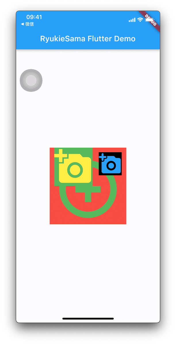
Container( margin: const EdgeInsets.only(left: 12), color: Colors.green, child: const Icon( Icons.add_a_photo, size: 100, color: Colors.yellow, ),),4. padding
内边距,通过对比可以明显发现红色区域被由内而外的撑大了
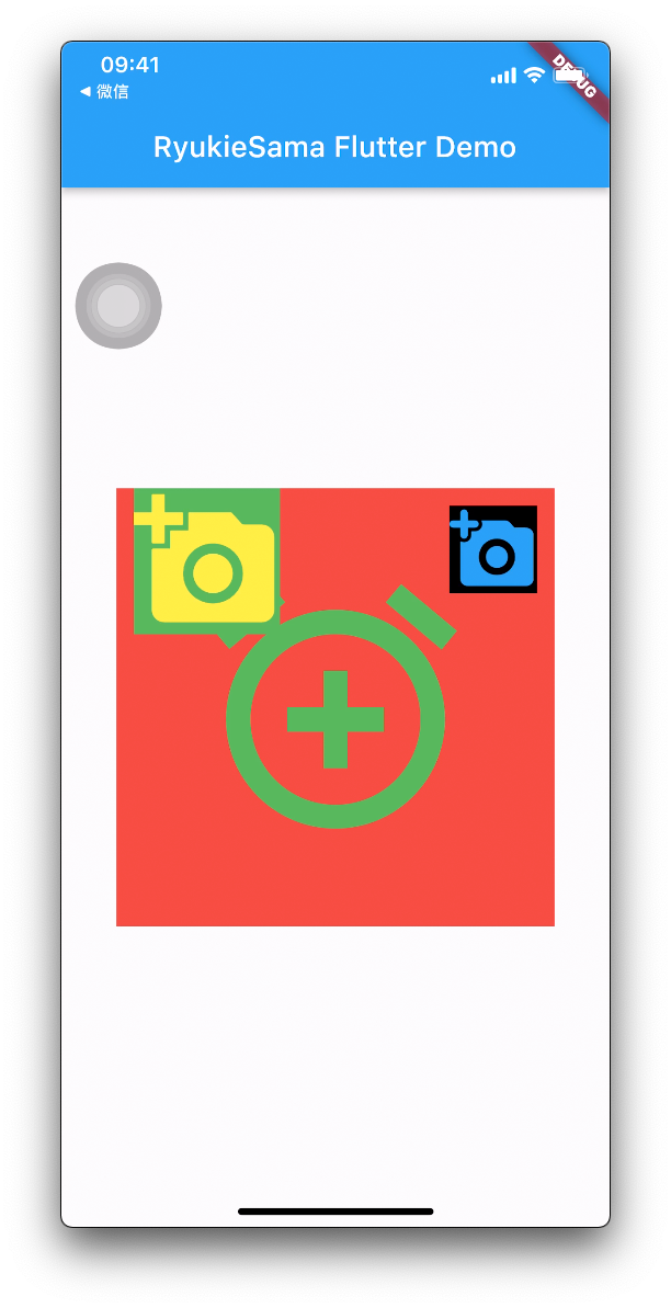
Container( padding: const EdgeInsets.all(50), color: Colors.red, child: const Icon( Icons.add_alarm, size: 200, color: Colors.green, ),),5. Positioned 与 margin 的区别
从上面的效果可以看出,这里好像 Positioned 与 margin 的效果基本一致。
- Positioned
- 尽可用于 Stack
- 相对于父Widget的
- margin
- 外边距
- 相对于相邻Widget的
二、 宽高比
用 AspectRatio 可以来指定 宽高比
如果同时设定了宽高那么
AspectRatio就会失效
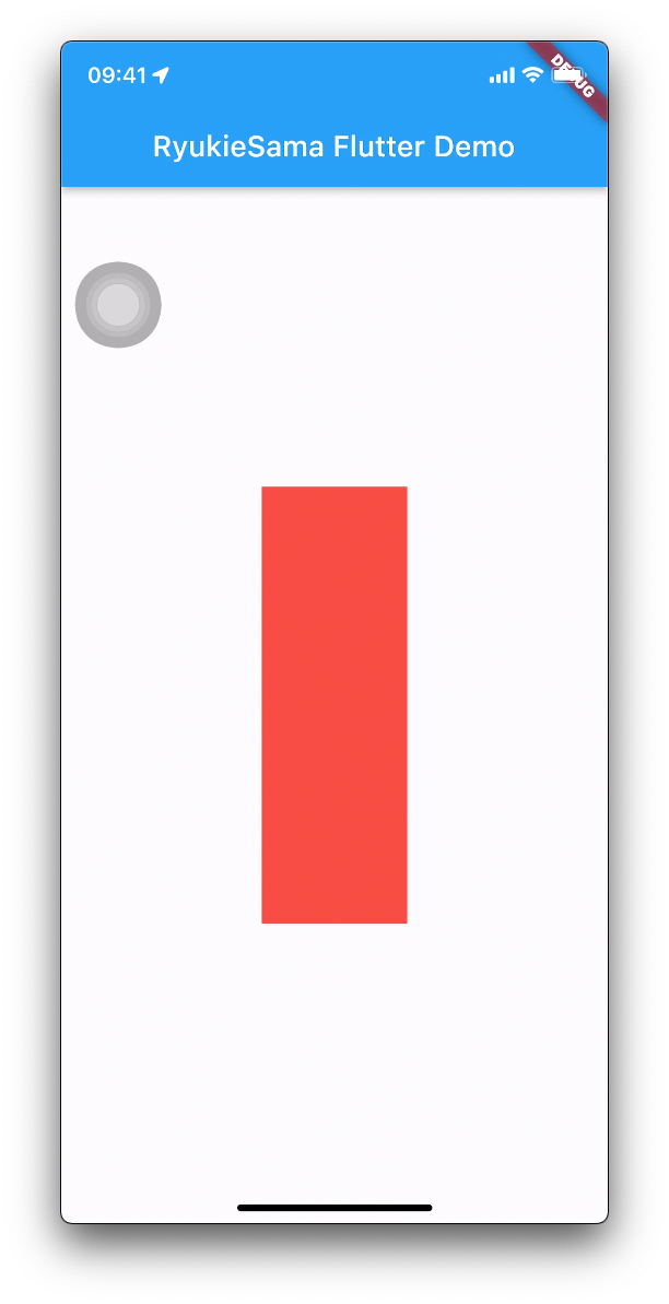
class MyRatio extends StatelessWidget { const MyRatio({Key? key}) : super(key: key);
@override Widget build(BuildContext context) { return Container( color: Colors.white, child: Container( color: Colors.red, width: 100, child: const AspectRatio(aspectRatio: 1/3), ), ); }}